Borders
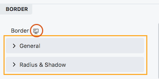
Rows, columns, and some modules have a Border section, as shown in the following screenshot.

The Border section is divided into two main subsections:
- General
These settings apply to the standard border around an object, described in the next section. - Radius & Shadow
These settings are described in the Radius & Shadow article.
The device icon appears at the top of the Border section, so you can adjust all of the border settings responsively for large, medium, and small devices. If you don't add settings for each device size, the settings for the desktop apply to all sizes.
The General subsection
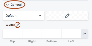
The General subsection has the following settings, shown in this screenshot and described below

The General button has fields for the type of border, the color, and the width of the line, set in pixels.
If you want all the width values to be the same, set a width for one edge and click the Link icon next to the Width label to populate all of the fields. The Link icon is a toggle, which means it will keep all of the Width values in synch until you click the icon again.
